Portfolio Modeler Bubble Chart
This article explains how to access and use the Modeler strategic bubble chart.
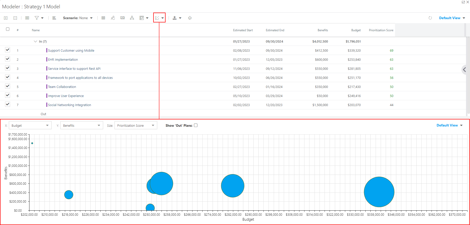
Click on the Charts icon to open the drop down. Then select Bubble Chart. The chart will open in the bottom half of the screen.
When you first open the Bubble Chart, it will be blank. You need to set up the X and Y axis, and the bubble size values. Follow the instructions in Set Up the Chart.
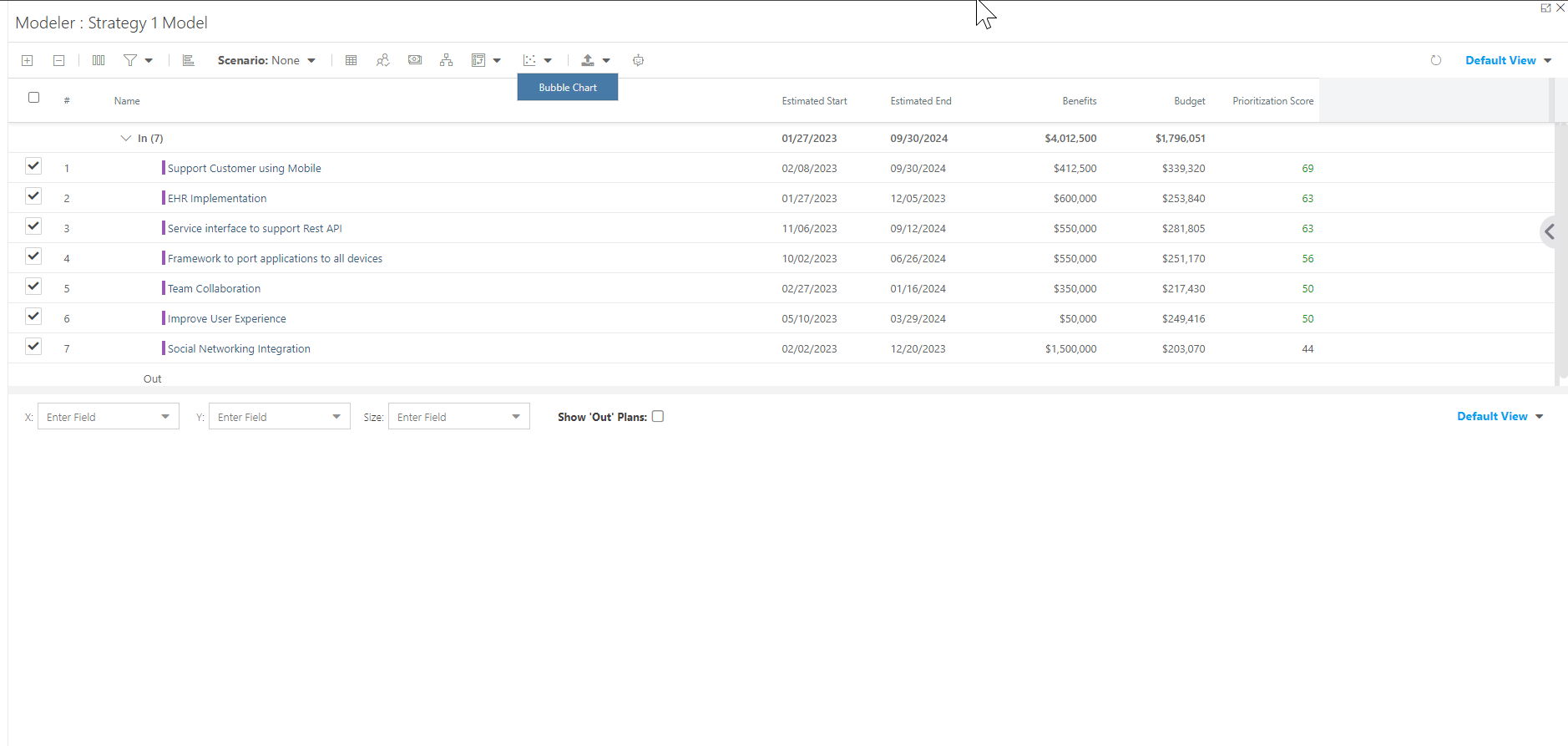
Set Up the Chart
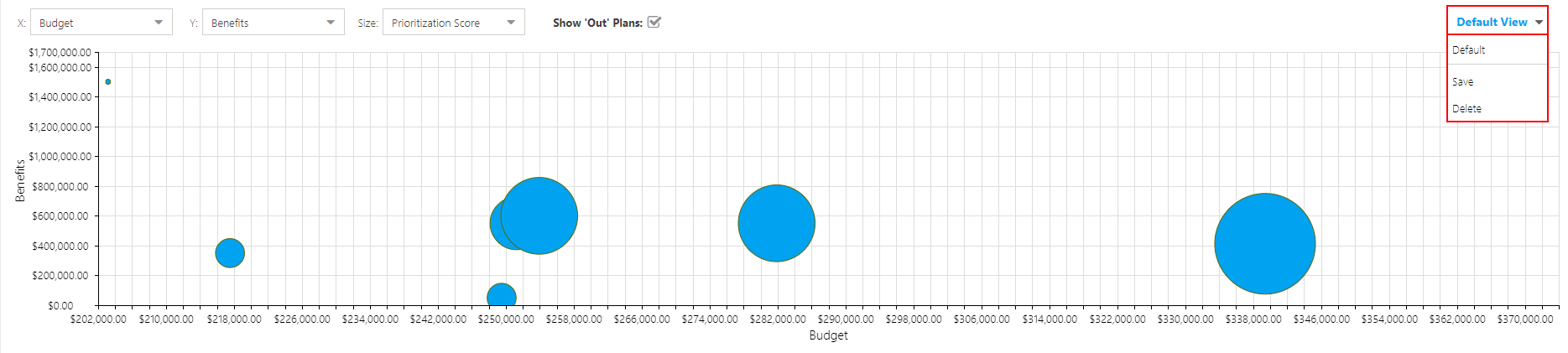
The Portfolio Modeler Bubble Chart lets you select fields you want for each axis of the chart to easily visualize and compare your plans across your portfolio.
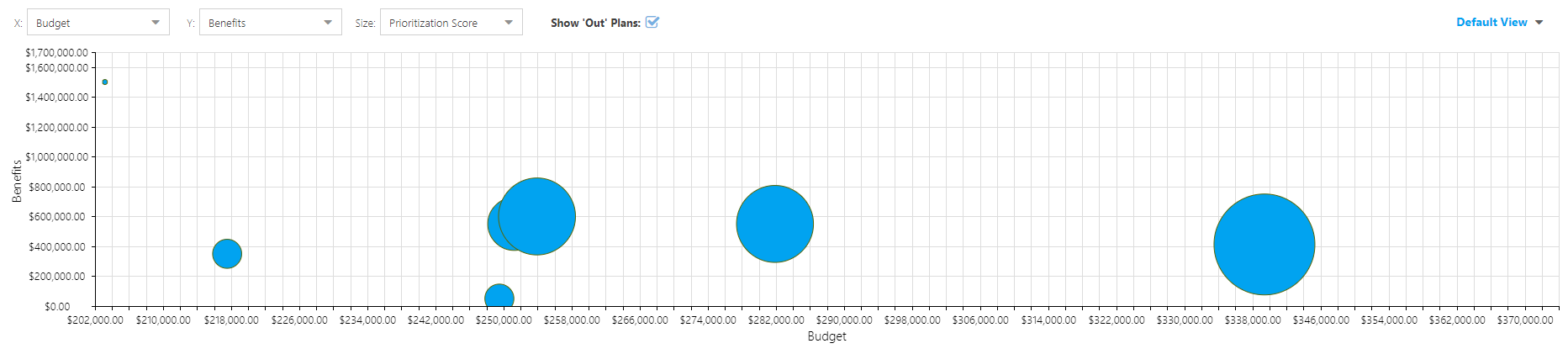
To set up the bubble chart, select fields for the X and Y axis, and the bubble size from the drop downs at the top of the chart. You can also select to include plans that are "out" in the model. By default, the bubble chart only displays plans that are marked as "in" in the model.

In this example, I have selected the following values:
X Axis: Budget
Y Axis: Benefits
Bubble Size: Prioritization Score
Show "Out" Plans: Yes
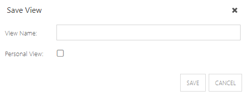
Save the Chart View
To save the chart configuration:
Select the View drop down, then click Save. The Save View form will open.
Complete the Save View form:
Name: Enter a name for your view.
Personal View: Check the checkbox to save the view as a personal view for your use only.
Click Save.